
This article was originally published by Ciprian Borodescu in Smashing Magazine.
When Google announced the launch of its new mobile ranking system, dubbed Mobilegeddon by the press, everybody agreed that the impact would be devastating on those businesses that didn’t have a mobile web presence. At that time, we conducted a study of the top 10,000 sites from Alexa and showed that four out of ten sites would be affected by Google’s update.
Eight months into the apocalyptic event, we repeated the study because we wanted to measure and understand the real proportions of such an important development. We crunched the data and discovered some interesting findings — this article details the most significant ones.
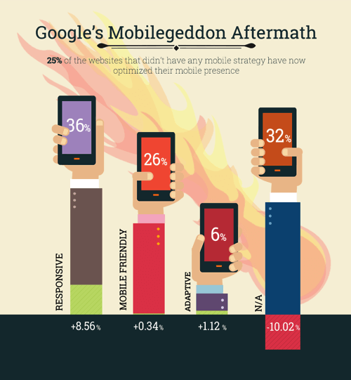
25% of websites without any previous mobile strategy have made the switch
An unprecedented demand has been unleashed on the web for a swift solution to Google’s move and, as anticipated, site owners have responded with urgency and approached the situation in various ways.
25% of the websites surveyed that didn’t appear as mobile-optimized in April 2015 have since gone on to implement some kind of mobile optimization strategy. Of these, the majority — 85% — have used responsive web design to go mobile.
Another 11% chose adaptive (using the same URL regardless of device, but generating HTML code dynamically by detecting the browser’s user agent), while only 4% went for a separate web address for their mobile version.
E-commerce site owners focused on embracing a mobile strategy as fast as possible
Our study included websites from five key categories: news, e-commerce, tech, business, and sports. As expected, the e-commerce site owners were the quickest to adapt. 31% of e-commerce websites that didn’t have any mobile footprint have turned their attention toward optimizing the experience for their on-the-go users.
This makes perfect sense if we take into account the conversions from natural search in 2015. Whether we’re talking about online purchases, creating accounts or filling out contact forms, conversions were up 27% compared to 2013. Growth was especially strong for e-commerce websites, with an average natural conversion growth rate above 40% according to Search Engine Watch.
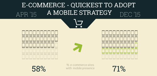
While SEO is an important aspect for any type of website, these numbers show that e-commerce website owners take mobile SEO seriously and consider it their top priority. They understand that not being present in results for people searching on their mobile device translates into missing out on a huge slice of the business opportunity.
Publishers are thinking beyond responsive for their mobile strategy
Websites from the news category revealed an exciting particularity. To begin with, only three out of ten websites were not optimized for their mobile audience; eight months later, however, we identified that publishers adopted a rather bold direction: the number of apps for those publications that already had a responsive website saw a 530% increase.

One plausible explanation for this particular trend is the publishers’ interest in distribution and their belief that a native app will bring more visibility to their content.
Earlier in 2015, Forrester showed that on mobile, consumers spend over 85% of their time using just five apps they’ve installed from the App Store. That being said, it’s probably best for businesses to design their apps only for their best and most loyal or frequent customers – because they are the only ones who will bother to download, configure and use the application regularly.
This certainly applies to publishers, since keeping their loyal readers engaged is critical for their businesses.
Click here for the full article.
Did you find these tips helpful? Here are other resources you might enjoy!
Are you interested in website design, development or other B2B marketing services? Contact Sagefrog Marketing Group, today