
Email marketing is an ever-evolving channel. It’s a far cry from what it looked like several years ago, but that doesn’t mean it’s any less relevant. When campaigns are efficiently set up, email marketing can make a significant impact on annual revenue, at a reasonably low cost. Constructing the perfect email however is not easy as it might seem – rather, it involves the hard efforts of everyone on the creative team, from strategy and content to designers to developers.
Learn what goes on behind the scenes to create the perfect email experience, as well as how the market and technology has changed over time.
1. Getting your emails opened: it’s all in the details.
Making sure your email gets opened doesn’t take much. In fact, it may as well be limited to 140 characters. In today’s instantly gratified society where first impressions are key, your subject line should be somewhere around 50 characters or roughly 4 to 7 words. Combine this with some enticing pre-header text at 75 to 100 characters and you’ll be hitting the inbox sweet spot. Be sure to use your characters wisely though by building intrigue, being direct and avoiding click-bait. An over-promising statement about your content will only decrease the value and success of future emails.
Additionally, how frequently a contact’s inbox is inundated and at what time of day could also earn you a loss before you even get started. So, when is the best time of day to deploy your emails? While there is no best time per se, the more information you have on your audience the better. A few tips:
- If you’re targeting a larger, urban-focused list, try sending your email during commuting hours when people are likely to check their emails on trains and buses.
- If you’re seeking less competition, then sending your email on the weekend could be a worthy tactic.
- Emails sent between 8PM to 12PM on the weekend have a 10% higher click-through-rate, according to a recent benchmark study by Experian.
The best way to find out when to deploy your email marketing campaign is to utilize A/B testing in which you deploy similar content at different times and compare the results. Lastly, make sure your email is coming from an address the subscriber is familiar with and avoid using ALL CAPS and excessive punctuation!!!! These no-no’s could land your email directly in the spam folder.
2. Getting your emails clicked-through: think user experience.
It’s important to test your email templates to see how they appear on desktop and mobile devices, remembering that desktop opens have much more ground to cover. Include call-to-actions (CTAs) and make sure buttons and links are easy to click for those using touch screens. Scrolling comes naturally to people using mobile devices and since the user is scrolling with their thumb, it causes them to be more reactionary. As such, touch-friendly buttons need to be clear and rewarding. Using a ‘depressed effect’ on buttons is often a good idea to reward the tapping interaction vs. a desktop click. Moreover, conveniently located CTAs will eliminate the struggle of hand limitations on mobile. The inverted pyramid below is one tactic that designers use to structure eye flow and attract clicks.
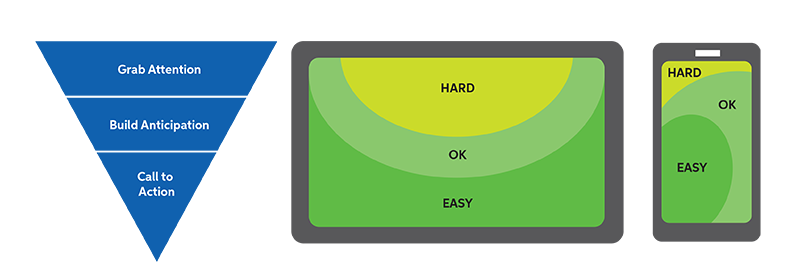
First, grab the attention of the user, build anticipation and call them to an action – all in a downward flowing motion. One CTA per email will help drive click rates by keeping the user on one path. All other CTAs can live on the websites themselves. Make sure that your email content follows the same SEO rules as your website does, using your best keywords and anchor text when constructing the body of the message. Include social media sharing buttons to stretch the content even further.
3. Getting your emails to appear perfectly: play it safe.
For starters, get a handle on your fonts. The average email subscriber won’t have fancy, non-standard fonts installed on their computer – so stick with something safe. Also, be sure to keep your font size above 16pt for easy readability and consider enlarging it up to 20% for mobile.
Next, let’s talk about images. We all know beautiful brand imagery can bring an email to life. So, here I am to ruin the fun, yet again. It’s best to assume that images will initially be blocked by email filters. However, that doesn’t mean the visual identity of your email is doomed. Brand your email with the fold in mind, using a color scheme that compliments your brand strategy (tip: Images hold a higher value if what you’re selling is visual or aspirational). The majority of email subscribers block images by default so designers should never rely on images to communicate the main message of an email. Use descriptive alt text to plan for blocked images. Offer both plain text and HTML versions of your email and aim for a ratio of 80% text to 20% image. If the content of your message is valuable enough, it’s all you’ll need to engage the recipient. After all, if the email is already opened, half the battle is won.

4. Getting your emails to function optimally: get with the times.
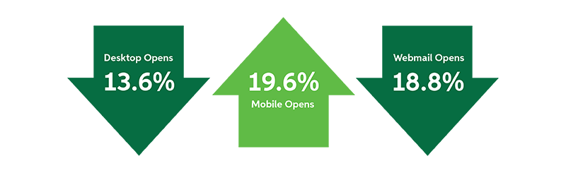
February 2016 ended with mobile representing 55% of opens, webmail with 26% of opens and desktop with 19% of opens.
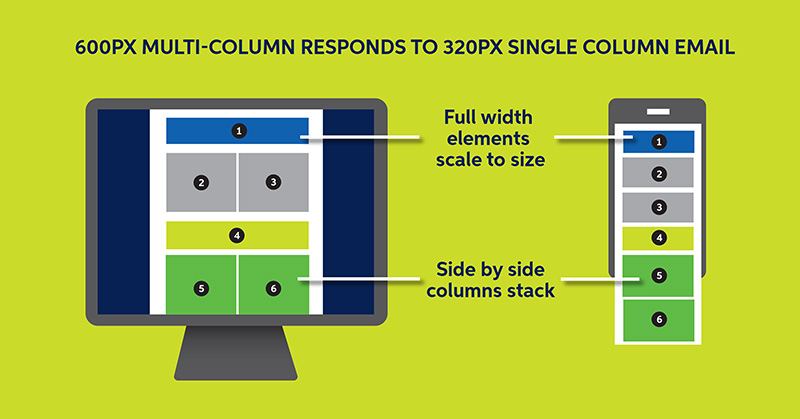
With mobile dominating email opens, it is no secret that responsive design is all the rage right now. So, what is responsive design anyway? It’s a necessary approach that suggests that the design and development should respond to the user’s environment based on screen size and orientation. From a design and development perspective, it adds the ability to adapt hierarchy, layout, navigation and the size of images, fonts and other content. Features include:
- Flexible Grids and Layouts
- Shift columns, change text styles, colors and font size to adapt to screen size
- Percentage units to define widths that allow columns and images to adapt
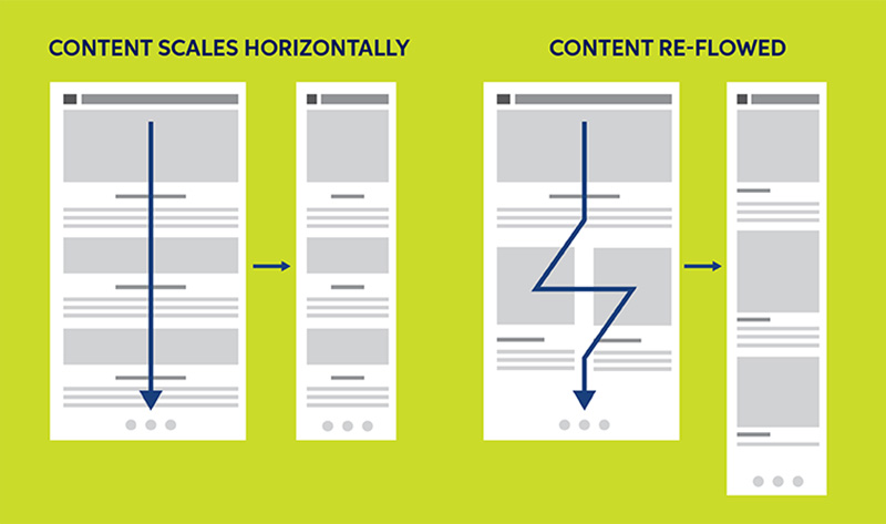
- Fluid Images
- Relative width of 100% and maintain aspect ratio as they scale
- Text in images is not recommended as image scaling can result in unreadable text
- CSS Media Queries
- Allow content to shift and adapt based on screen size
- Allows different styles to be applied to layout and content
- Tailor the design based on screen size and orientation
Did you find these tips helpful? Here are other resources you might enjoy!
Are you interested in email marketing or other B2B marketing services? Contact Sagefrog Marketing Group today.
Sources: